Article Text

Abstract
Misalignment of measures, measurement and analysis with the goals and methods of quality improvement efforts in healthcare may create confusion and decrease effectiveness. In healthcare, measurement is used for accountability, research, and quality improvement, so distinguishing between these is an important first step. Using a case vignette, this paper focuses on using measurement for improvement to gain insight into the dynamic nature of healthcare systems and to assess the impact of interventions. This involves an understanding of the variation in the data over time. Statistical process control (SPC) charting is an effective and powerful analysis tool for this. SPC provides ongoing assessment of system functioning and enables an improvement team to assess the impact of its own interventions and external forces on the system. Once improvement work is completed, the Standards for Quality Improvement Reporting Excellence (SQUIRE) guidelines is a valuable tool to describe the rationale, context, and study of the interventions. SQUIRE can be used to plan improvement work as well as structure a manuscript for publication in peer-reviewed journals.
- education
- outcomes
- treatment outcome
- outcome assessment
- health care
Data availability statement
There are no data in this work.
Statistics from Altmetric.com
Dr. Gutierrez receives the call about the elderly hip fracture patient in the emergency department. It will be another test of the protocol the interprofessional team developed last year to increase the use of regional, rather than general, anesthesia for these patients. Although a few early studies showed mixed results about regional anesthesia’s benefits for elderly hip fracture patients,1 2 there is encouraging emerging evidence that this may lead to lower mortality, less postoperative delirium, and shorter intensive care unit (ICU) stays.3 Interpreting evidence and implementing into practice can be tricky, especially in complex systems.4 Their protocol has been in place for 6 months, so she is anxious to review the data next month to see whether it has made a difference for the two anesthesia teams—the overall baseline was 37% in the 9 months prior to the protocol and use of regional anesthesia seems to be higher now. She thinks about these data as she heads to assess the patient.
This vignette demonstrates a common conundrum for physicians and improvement teams: waiting to review data after a change has been made to determine whether the change has resulted in an improvement. Access to healthcare measures, measurement, and data (both quantitative and qualitative) have exploded over the past two decades. Electronic health records and web-based interfaces make it easier to gather data, but simply gathering data does not make it understandable or actionable. Why is it still a struggle today to use data in clinical improvement?5
While the act of measuring healthcare processes and outcomes has become an integral part of healthcare, most healthcare professionals do not receive sufficient grounding in improvement measurement and statistical applications to cope with the growing demands to collect and analyze data for improvement. There are many challenges. Not all measures are useful, and often there are too many or not the appropriate ones for the actual work that is done. It is challenging to make sure data are accurate and consistent. On top of this, measurement may feel threatening when used for performance reviews or compensation.6 If data are gathered and not used—especially not used to inform decision-making—then many become disillusioned with the measurement process. The best of intentions for collecting and using measurement becomes muddled and ineffective.
When done well, measurement for improvement helps make decisions and feel more confident in those decisions. In discussions, measurement can provide a common frame of reference and help focus on what is important. Finally, measurement can move decisions away from anecdotes and one person’s view to a comprehensive view of the functioning of the system. Using data appropriately for quality improvement (QI) leads to increased insights into the functioning of the system, increased confidence as to whether a change results in an improvement, and, ultimately, improved health and healthcare for patients, families, and communities.
This paper will describe the unique aspects of measurement for improvement, introduce the use of statistical process control (SPC) to analyze data, and provide guidance for publishing QI work in the peer-reviewed literature.
Approaches to healthcare measurement
Healthcare professionals often ignore the iterative, cyclical nature of the scientific method and view measurement as if it was a singular event. Solberg et al point out that there are three fundamental facets to measurement in healthcare: research, accountability, and improvement7 8 (table 1). Identifying the type of data is a first step to using data for improvement. Misaligning the type of data with the intent can augment frustrations noted earlier.
The characteristics of the three types of measurement in health care6
The aim of research is to develop new generalizable knowledge, test existing theories for discovery, or determine efficacy.9 Experimental designs provide the most control and maximize the validity and reliability of the results. Statistical analysis of research data interprets the overall effect of the intervention as opposed to change from other factors. Measurement for accountability is used by administrators, policymakes, payors, clinicians, and others to compare outcomes of aggregate data. These data are often displayed in a table that compares groups and asks, “Is performance better now than it was the last time?” or “Which group (ie, individual, medical group, hospital, city) is performing best?” Performance is often compared against fixed targets or goals, and data are usually descriptive and do not routinely include statistical analysis.
Measurement for improvement focuses on monitoring the functions and outcomes of a system over time to determine whether interventions have had significant effects on the performance, processes, and outcomes of a system.9 Research measurement helps determine “the what” while improvement measurement determines “the how” in a particular context (eg, How effective are we implementing an idea, technique, or process so that it performs reliably?)
These three types of performance measurements are not fully independent but are related to one another. One approach is not “more valid” or better than the others. In healthcare institutions, physicians and others may need to act as translators between these three approaches to ensure the appropriate type of measurement is applied to the appropriate problem.
In the opening vignette, the improvement team needs to collect improvement data for the local context, not research data, for there is evidence in the literature that regional anesthesia for hip fracture repair in the elderly is safe and effective.3 The team could look at accountability data and examine the performance of different clinicians, teams, shifts, or hospitals. Accountability data (table 2) provide Dr Gutierrez and the improvement team some initial, but limited, insight into the variability in how the system is performing. The challenge is that aggregated data presented in tabular formats or with summary statistics do not measure the impact of process improvements or redesign. Aggregated data are useful for accountability, not for improvement.7 Table 2 shows that the Blue Team started at a higher rate, the Red Team made a larger improvement from baseline, and one-third of patients are still not receiving regional anesthesia for their hip fracture repair. Dr Gutierrez and the improvement team want to understand what is happening with the protocol intervention.
Per cent regional anesthesia use for appropriate elderly patients with hip fracture for 9 months prior to and 6 months after the initiation of the protocol
Variation within data
Understanding variation is key to improvement measurement as it provides insight into the functioning of the system and guides actions. Knowing the type of variation in a system allows the team to take action when needed, not take action when not needed, and informs iterative changes that are driven by data.6 10–12 Failing to account for variation and interpret it leads to seeing trends where there are no trends, explaining natural variation as special events, and potentially assigning credit or blame to individuals or groups for things over which they have little or no control.
Insight into the variation begins with clear operational definitions of the measures themselves. An operational definition is a specific, detailed description of the measure, so that everyone (on the improvement team and outside the team) knows exactly what each measure describes.6 8 The measures may be provided to or developed by the team. Insisting on clear operational definitions of each measure assists the team in aligning the measures with the aim and the changes to the system. Process measures are those which evaluate actions that are directed or known to influence the end result. For example, the percentage of elderly patients who receive regional anesthesia for a hip fracture each month is a process measure. Receiving regional anesthesia is not the end result of the process but is an evidence-based intervention that can improve the outcomes.3 An outcome measure assesses the end result of a process (or several processes). Outcome measures may be considered more important because they represent the consequences of the processes but are often downstream from the processes that contribute to them. In this example, outcome measures might include the length of stay in the ICU, the percentage of patients who develop postoperative delirium, or the revenue and costs of the procedure. Process and outcome measures should be used in combination in improvement work.
Unlike comparative statistics that seek to identify differences between groups, statistical analysis for improvement monitors systems over time with dynamic, continuous assessment.11 Comparative analyses look backward and reflect on what has been measured in the past. While these analyses provide a summary of where the system has been, they provide limited view of what lies ahead. In contrast, analyzing data over time, with the use of SPC charts, or simply “control charts,” offers a different perspective. SPC analysis can identify how a system is currently functioning, predict future functioning, and provide insight into variation with this statistically powerful method.
For the data from the regional anesthesia hip fracture team, the team started with comparative summary statistics using a before and after data of per cent use of regional anesthesia for appropriate elderly hip fracture patients. Table 2 demonstrates an increase in use from 37% to 67% for all patients, and the red team made a greater improvement than the blue team; however, displaying the data by month begins to show the month-to-month variation (table 3). Plotting these data on a line chart makes the variation more noticeable (figure 1). The blue team had more variation prior to the initiation of the protocol. Some months were in the high 60s and others were in the 20s. The red team seems to have had less variation prior to the protocol, made a large jump right after the protocol was started, then leveled off. Since the goal is that 100% of appropriate patients receive regional anesthesia, even though both have improved, neither is near the goal. SPC can help to understand the variation in the data and, most importantly, direct future changes to the teams. SPC is focused on gaining insight and action, not just identifying what has occurred in the past.
Per cent regional anesthesia use for appropriate elderly patients with hip fracture by month for 9 months prior to (March 2019 to November 2019) and 6 months after (December 2019 to May 2020) the initiation of the protocol
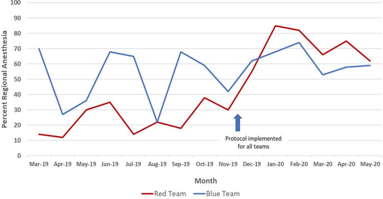
Line chart of per cent regional anesthesia use for appropriate elderly patients with hip fracture (March 2019 to May 2020).
Statistical process control
Two-point, before–after studies are a weak demonstration of change.11 The limitation of before–after analysis can be addressed by capitalizing on the concept of replication. Replication, or the process of evaluating successive, sequential data points, creates confidence that an intervention produces the pattern of change observed in the results. SPC uses the principle of replication for analysis to demonstrate whether a change has occurred from preintervention (baseline phase) to postintervention (implementation phase) and through multiple successive interventions. These are within the family of time-series analyses that plot multiple points where each point represents the operationally defined unit of measurement (such as a daily, weekly, or monthly data).10 11
When an SPC chart contains at least 12 data points, the statistical probability of a significant change in the data (a “signal” from an increase or decrease in performance or an unusually high or low point) is less than 5% (ie, equivalent to a p value <0.05). This is based on probability statistics of replication which generates power from point-to-point variation to detect a signal. When a signal appears in a chart, it is the same power as a p value <0.05 that occurs in comparative statistics.11 SPC detects that a statistically significant change has occurred in a system, but the improvement team must identify why it has occurred: a new process, reaction to an intervention, stress to the system from an external source. Evaluating a system with these tools identifies what has occurred in the system and gives the team the opportunity to gain insight into why the system responded as it did. While SPC has been used for monitoring processes in cardiac surgery in 1996,13 an ICU as early as 2007,14 and is more common now, it still has not gained widespread use in the peer-reviewed literature.
An SPC chart uses the point-to-point variation in the data to derive control limits. The most commonly used SPC chart is called an XmR chart that uses the average (X) as the measure of central tendency and the moving range (mR) to calculate the control limits. (XmR charts are also called “Individual” or “I-chart”). Figure 2A,B 15 are the XmR charts for the red and blue teams. Upper and lower control limits (UCL and LCL) represent boundaries that are about three SD on each side of the average and are calculated by the SPC software.15 Thus, as each new point is added to the chart, the average, UCL, and LCL are updated. This is the important dynamic characteristic mentioned earlier. Because these change when each point is added, it provides a dynamic assessment of the system with each new point.

(A) XmR chart of Red team per cent regional anesthesia use for appropriate elderly patients with hip fracture (March 2019 to May 2020). (B) XmR chart of Blue team per cent regional anesthesia use for appropriate elderly patients with hip fracture (March 2019 to May 2020).
The basic anatomy of an SPC chart has time (or sequential observations) on the x-axis and data values on the y-axis (month and per cent, respectively, in figure 2A,B). Individual data points are plotted in the body of the figure with the average (green line, “CEN” for central) and UCL and LCL (orange lines) derived from the data. These control limits provide the parameters used to gain insight into the type of variation present.
Common and special cause variation
Common cause variation is inherent in any process. It is always present in a system and can be considered the baseline variation.6 9 11 For example, a person who takes his blood pressure each morning for 30 successive days will likely have a different systolic blood pressure each morning. The day-to-day variation in the systolic blood pressure—assuming nothing else acts on the system—is the common cause variation. When common cause variation is present on its own, it results in a stable, predictable process.
Special cause variation is due to effects that are often external to the process and impact the performance of the system.6 9 11 Special cause variation occurs by chance only 5% of the time (p<0.05), so when a special cause signal appears on an SPC chart, the team needs to determine why it occurred. If the person with only common cause variation for his systolic blood pressure now receives an antihypertensive medication, his systolic blood pressure will decrease. The SPC chart will show a special cause signal with a decrease in systolic blood pressure while the analysis of the individual’s blood pressure system will need to determine whether the decrease is from the medication, dehydration, or some other factor.
Common cause variation does not mean “good” variation. It only means that the process is stable and predictable. Similarly, special cause variation does not mean “bad” variation. A special cause signal may represent a very good result (eg, appropriate decrease in blood pressure from starting a medication, which should be maintained). Special cause merely means that something has affected the process to make it unstable and unpredictable. The key point is that knowledge of the aim of the improvement, the work processes of the system, and the context determine whether the outcomes are acceptable or not. In measurement for improvement, the analysis becomes part of the feedback process, and it can (and should) influence the changes in the system.
Determining the presence of special or common cause variation has implications as to whether and how you should act on a system. If action is needed in a system and you indeed take action; this is appropriate. Similarly, if action is not needed and action is not taken, this is also appropriate. Losses in efficacy and efficiency occur when action is needed but not taken from passivity. Similarly, if action is not needed but is taken—for example, many changes are made to a process without understanding the underlying variation—the system may experience a loss from tampering.6 Understanding the variation in the system’s data with SPC leads to insights into the processes which leads to more effective change.
Interpreting SPC charts
Since common cause variation is always present, analysis of a control chart focuses on identifying whether special cause variation is present. This is done by applying rules of detection. If none of the rules are fulfilled, then the chart indicates only common cause variation. These rules are derived from the probability that certain patterns would not occur by chance alone. The rules balance the risk of type 1 error (ie, there is no change, but the data show a change) with a type 2 error (ie, there is a change, but the data do not show it). There are multiple rules to detect special cause variation, but this will focus on the three most commonly used.
An SPC chart requires at least 12 points for sufficient power to draw conclusions. The width of the control limits (distance between the UCL and LCL) estimates the overall variability. More narrow control limits (figure 2A) indicate less overall variability than wide control limits (figure 2B; UCL is above 100%). Special cause variation is present when one or more of the following are fulfilled10:
A single point or multiple points fall outside a control limit.
A shift in the process occurs with seven or more consecutive points on one side of the average.
A trend of seven or more points continually increasing or decreasing.
Figure 2A shows the month-to-month variation for the red team. As in the line chart (figure 1), the red team made significant improvement right after the protocol was implemented. There are two special cause signals with two points above the UCL in January and February 2020 and a shift of nine points below the average from March 2019 to November 2019. These special-cause signals indicate that the performance during that period was statistically different (less than 5% possibility that this occurred by chance alone). Figure 2B for the blue team demonstrates no special-cause signals. Since there is no special cause variation, only common cause variation is present with wide control limits. The UCL is above 100% in this chart, so it is omitted. Statistically, there is no change from baseline for the blue team, although the data from December 2019 to May 2020 appear to show a decrease in month-to-month variability.
SPC charts are a tool to gain insight and guide action towards a goal. Perhaps the red team had more members of the interprofessional improvement team and so they were more compliant with the new protocol? Maybe the blue team had early adopters before the protocol was officially initiated but they were not effective in gaining acceptance by others? The SPC chart can tell when a statistically significant change has occurred or not occurred in the process, but it will not tell you why it occurred or not. The improvement team must go back and forth between the analysis of the SPC chart and the processes that are producing the results. In a research paradigm, this may seem like tampering with the intervention protocol (table 1).6 8 In improvement, when the team is driving towards an evidence-based goal, it is core to understanding where the processes have been, where they currently are, and where they are going.
When there are special-cause signals, the team should address those first and understand why they occurred and whether the cause of the signal should be eliminated or amplified (depending on whether it moved the data away from or towards the goal, respectively). The red team is moving closer to the goal, so the team should understand what has been effective. But what if there are no special cause signals, as with the blue team? The actions to address common-cause variation are quite different. Instead of addressing specific issues the improvement team needs to examine the overall process of the blue team.11 With only common cause variation, it is likely that the team needs a significant redesign of their processes to move closer to the goal. Just implementing the protocol has not been effective for the blue team.
Using control limits to gain additional insights
Another feature of an SPC chart is that the control limits can be applied to groups of data in a chart. In other words, one chart may have data with two or more sets of control limits. For example, to evaluate the effectiveness of the intervention in November 2019, control limits for the process before the intervention can be set, and new control limits can be recalculated reflecting the time after the intervention is implemented. This is called splitting and recalculating the control limits and may also be done when there is a shift or trend on the chart; figure 3A,B demonstrates this. Notice that the red team (figure 3A) now shows only common cause variation after the intervention with rather wide control limits. So, although the team made a statistically significant change from baseline (figure 2A), they have plateaued since then. This guides the team to take further action by examining the postintervention process and making further changes to drive the performance higher. The blue team (figure 3B) had very wide variation before the intervention (the UCL is above 100 and the LCL is below 0), but much less variation after the intervention. While their average performance is not as high as the red team in the past 6 months, they are, perhaps, more consistent in their use of the protocol. The intervention to move them higher may be very different than what is needed for the red team.

(A) XmR chart with split and recalculated control limits of Red team per cent regional anesthesia use for appropriate elderly patients with hip fracture (March 2019 to May 2020). (B) XmR chart with split and recalculated control limits of Blue team per cent regional anesthesia use for appropriate elderly patients with hip fracture (March 2019 to May 2020).
Control limits also provide a predictive function because they indicate a range of where the next data point may fall. A point that is outside the control limits would only occur by chance less than 5% of the time (a special cause signal). It is 95% likely that the next point will fall between the control limits. For the red team, they can expect June of 2020 to be between 33% (LCL) and 100% (UCL >100%) compliance with the protocol (figure 3A). The blue team would expect June 2020 performance between 42% (LCL) and 83% (UCL) (figure 3B). As each data point rolls out, it is added to the chart, and the average, UCL, and LCL are recalculated including the new data point. This exemplifies both the dynamic nature of these charts and the predictive properties of this method. It is equally likely, with 95% confidence, that the red team will be 100% or 35% in June based on the prior performance. The blue team has more narrow control limits, so even though its average performance is lower than the red team’s, its future performance is more predictable because of the narrow control limits. One important caution is that there are only six data points in the segment since the implementation. When there are fewer than 12 points in a segment, there is an increased risk of a type 1 error, so exercise caution so as to not overinterpret the data. It is prudent for the team to monitor the process, add points to the chart each month, and analyze once there are at least 12 points in the segment .
The XmR chart introduced here is robust enough to be used with any type of data. In addition to XmR charts, other specific control charts may be used depending on the underlying distribution of the data (normal, binomial, geometric). The underlying distribution changes how the control limits are calculated; however, the control limit calculations in the XmR chart make it rigorous enough to be used with any data that have any underlying distribution. For more detailed information about control charts in healthcare settings, see the texts by Provost and Murray11 or Carey and Stake.10
Dr Gutierrez and the improvement team are now more confident in understanding how each anesthesiology team is performing and how it might be performing in the future. They are excited by their success, have identified where they might improve, and, from their other measures, have noticed that the new protocol has decreased the length of ICU stay and the occurrence of delirium in elderly patients who present with a hip fracture. The team would like to share their work in the published literature so that others can learn. But how should they write up the QI work? Is it the same as a research article?
Using a structured framework to disseminate improvement work
Publishing and presenting improvement work can be challenging. Many journals, editors, and peer reviewers are skeptical about publishing reports of improvement efforts because it is methodologically different than traditional published research articles in the intent, methods, and analysis. Research seeks to create new generalizable evidence while improvement seeks to create system-level changes that implement evidence-based practices for patients.4 16
The Standards for Quality Improvement Reporting Excellence (SQUIRE) publication guidelines provide a structure to share improvement work in the scholarly literature.17 18 SQUIRE provides guidance on planning and reporting original studies of QI. The complete guidelines and other tools are available at www.squire-statement.org. It acknowledges the context dependence, complexity, and iterative nature of improvement work. SQUIRE balances measuring the impact of the improvement work (“Did the system improve?”) with discovery and explanation of the mechanisms at work (“Did it improved because of the interventions? How?”).
SQUIRE consists of 19 items with the familiar Introduction, Methods, Results, and Discussion format common in healthcare journals. Although authors should consider each of the 19 items, it may be inappropriate or unnecessary to include every element in a particular manuscript.
SQUIRE contains three core elements: rationale, context, and study of the intervention. A rationale may be a formal or informal framework, a model, or a theory to explain the assumptions used and the reasons why the authors expected the interventions to work.18 Researchers consistently use theoretical frameworks, models, logic diagrams, and other tools to explain why they believe that their interventions will be effective.19 Most improvement contains a rationale, but it is often implicit. For the anesthesia hip fracture improvement team, the rationale could be stated as, “Implementing an evidence-based protocol for elderly patients who present with a hip fracture will decrease the use of general anesthesia, the ICU length of stay, and the incidence of post-operative delirium.” This example reveals an anticipated causal chain of what the improvement team hypothesized would occur from the proposed intervention. Having this at the outset of the improvement work assists with identifying appropriate measures, modifying the interventions, assessing the effectiveness of the work, and planning the next set of interventions.18 In the manuscript, the rationale is a clear indication to the reader why the specific intervention was chosen and what to expect in the rest of the article.
Reporting of the context begins in the Methods section with a description of the initial contextual elements and continues throughout the manuscript with a description of how the context impacted the intervention, the measurement, and ultimately the results. Research studies aim to control contextual factors through their design and analysis. Improvement seeks to understand the influence of context and how it impacts the interventions and outcomes. SQUIRE defines context as “the physical and sociocultural makeup of the local environment and the interpretation of these factors by the healthcare delivery professionals, patients, and caregivers that can impact the effectiveness and generalizability of the interventions.”18 When publishing improvement work, describing the contextual elements is key for readers to understand whether the interventions will be applicable to their local environments. Context is more than the setting as it includes all the things that impact the interventions such as external factors (incentives, leadership, culture), internal factors (improvement experience, QI skill within the microsystem, data availability, collaboration across professions), and how individuals interpret these factors. Currently, no perfect “context instrument” exists, but there are several excellent frameworks in the published literature that may be helpful such as the Promoting Action on Research Implementation in Health Services framework20 and the Consolidated Framework for Implementation Research.21
A careful description of the context augments the analysis of the SPC charts. What were the factors that led the red team to make such a large improvement in using the protocol (figures 2a and 3a)? Why did the red team level off? The blue team did not statistically improve from baseline but decreased their month-to-month variability (figure 3b). Why is that? Factors may include the call schedule, individual anesthesiologist’s confidence in the evidence and the protocol, local practice patterns, the timing (weekday/weekend) of the cases, nursing support for the protocol, the electronic health record’s ability to make the protocol available, the physical layout of the emergency department and operating rooms, or the overall support for protocols at the institution. Reporting the improvement work is not about proving which of these was more or less impactful but about studying these throughout the improvement work and how they were addressed through the data-driven interventions. Writing clearly about the context helps the reader understand how the local context was navigated, so that they may understand and address similar issues in their own context.
The study of the intervention(s) describes the approach chosen for assessing the impact of the intervention(s) and establishing whether the observed outcomes were due, in fact, to the intervention(s). This is often the most challenging aspect of scholarly improvement, but it is vital for publishing. Studying the intervention is stepping back from the “doing” of the improvement and formally “studying.” It answers the questions, “Did the observed changes occur because of the intervention(s)? Did it work for the reasons you thought it did?” Studying the improvement requires an approach to understand what happened and why it occurred. Factors that influence the outcomes include the interventions, the Hawthorne effect (gets better because the improvement team is watching or paying attention), trends that occur within healthcare and society, cultural shifts, or external pressures.22 There are many influences on every system, so studying the intervention teases apart the effect of the intervention from other possible influences. Employing a research design such as randomization or stratification may be one way to study the intervention and usually requires training and expertise. Other ways may include a thorough assessment of participants’ satisfaction with the intervention(s) or an economic evaluation to determine whether the benefit of the interventions was worth the cost. Doing this well is one of the unique elements of scholarly improvement that will enhance the likelihood of a successful peer-reviewed publication.
The anesthesiology improvement team has many options to study their intervention. The intervention itself is a protocol in the electronic health record and activated only when an individual recognizes that there is a patient who fits the inclusion criteria (elderly, hip fracture, not excluded by comorbidities). Studying the intervention may include semi-structured interviews with the anesthesiologists to get a sense of their confidence in and use of the protocol. The team may assess the barriers that nursing staff have in activating the protocol. Additionally, they may want to measure how often the protocol is used completely and how often it is started and aborted. Why is it aborted? The intervention—a standard, evidence-based protocol—remains the same, but by studying the various aspects in the specific context, the improvement team begins to learn what works, for whom, and in what circumstances. For the manuscript, it provides the reader with critical information about how and why the intervention was adapted over time to reach maximum efficacy or why it was not successful in the specific context.
Rationale, context, and study of the intervention are core to publishing scholarly improvement work in the peer-reviewed literature. Together, they form the basis for a cohesive narrative that highlights the iterative, context-dependent nature of improvement. These elements are difficult to manufacture once the improvement work is completed. Attending to these at the outset will lead to a more thorough QI process that is ready to publish in the peer-reviewed literature with the SQUIRE guidelines.
Summary
It has been said that “your improvement work is incomplete until it is published.”23 24 This may not be true for every improvement project but is certainly true for QI done in academic health centers where the core mission is building a scholarly foundation. Using SPC to assess the progress of complex interventions provides a dynamic analysis that guides the improvement work and improves the confidence in the results. By sharing improvement work—both the successes and failures—through posters, abstracts, and peer-reviewed literature, the rate of change can increase, and the waste of making change can decrease. SPC and SQUIRE are two complementary tools for doing and disseminating improvement work.
Data availability statement
There are no data in this work.
Ethics statements
References
Footnotes
Contributors GO is responsible for all components of this manuscript.
Funding The authors have not declared a specific grant for this research from any funding agency in the public, commercial or not-for-profit sectors.
Competing interests I am a co-author and receive royalties from the publisher for the textbook 'Fundamentals of Health Care Improvement' which is cited in this article.
Provenance and peer review Not commissioned; externally peer reviewed.
Linked Articles
- Editor’s note